Do you want to show colorful charts, graphs, pictograms, or infographics on your website? Data visualization makes it easier for users to understand the data that you’re sharing.
Depending on your goals, there are a number of WordPress plugins and tools that you can use to create graphs, charts, and infographics.
In this article, we’ll share some of the best data visualization WordPress plugins and tools.

Understanding Data Visualization
Data visualization simply means turning numbers into graphics like charts, tables, interactive graphs, and infographics.
Creating a visual representation of data can make it much easier to spot trends and patterns. This helps you to figure out what your data is telling you.
For instance, when you look at Google Analytics to see how your website is doing, you’ll likely be looking at a line graph. This might show an upward trend in traffic over the past six months.
You could use data visualization to enhance your blog posts, to let visitors interact with your site, or even to create an email optin like a special report. All of this can help you build your audience and make money from your website.
Some of the tools we’re going to cover can also be used to create dynamic charts and tables that change based on the user’s input.
Let’s take a look at some of the best WordPress data visualization plugins:
1. WPForms: Survey and Polls Addon
WPForms is a premium WordPress plugin. It’s a fantastic way to run surveys or polls on your blog. It makes it easy for you to see the results in a visual way, too.
To run a survey using WPForms, you’ll need to sign up for the Pro account or higher through the WPForms site. Once you’ve done that, you can download and install the plugin on your site.
To create a survey, you’ll need to install the Survey and Polls addon. Go to WPForms » Addons in your WordPress dashboard to install and activate it.
A great advantage of using WPForms to create surveys is that your existing forms can easily be turned into surveys. This could save a lot of time if you already have a form that you’re using to gather data.
You can follow our instructions on how to create a survey in WordPress to make a survey using WPForms.
With this plugin, you can switch between different ways of visualizing your data. You’re not limited to just one type of graph or chart.
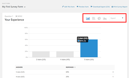
You can also download your graphs and charts in various formats, such as JPG and PDF. This makes it easy to use your results in blog posts as well as with colleagues, your boss, or clients.
Best for: Running surveys to get data from your website’s visitors. WPForms’ built-in tools will then turn this data into powerful visualizations like charts and graphs.
2. Formidable Forms
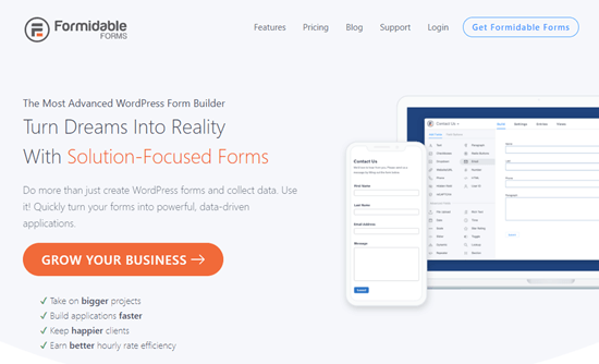
Formidable Forms is a highly advanced forms plugin for WordPress that lets you create complex forms.
You can use it to create a whole range of different forms, including column graphs, horizontal bar graphs, line graphs, pie charts, area graphs, scatter graphs, histograms, stepped area graphs, and geographic heat maps.
You can display the charts anywhere on your site using a shortcode. This makes it really easy to put them into your site’s pages or posts.
As with WPForms, you’ll need to use the plugin to gather data before you can create a graph. You can turn any form data into any type of graph, simply by setting the appropriate type in the shortcode.
You can style your graphs using different shortcode parameters. For instance, you can select the colors by adding hex codes to the shortcode. You can also filter graph data so that it’s specific to different users.
Don’t worry if you’re not very confident using shortcodes, though. Formidable Forms comes with a shortcode builder that lets you pick from a few dropdown lists to create your shortcode.
Best for: Anyone wanting to create a complex form or display a wide variety of data in different ways such as calculators, data-driven apps, user listing tables, directories, and more.
3. Visualizer
Visualizer is a table and charts plugin for WordPress that lets you create interactive data visualizations for your site.
The free version comes with 9 types of chart, including line charts, area charts, bar charts, column charts, pie charts, geo charts, table charts, bubble charts, and scatter charts.
You can add these charts without installing any extra plugins, too.
If you opt for the pro version, you get an extra 6 chart types and email support. There’s a full 30-day money-back guarantee if you decide you don’t like it.
You can also use Visualizer to create interactive tables for your site, such as a pricing table. Long tables can easily be paginated, and users can search and sort your tables.
Best for: Creating graphs and charts for free. If you’re just getting started with data visualization, the free version of Visualizer could be a great place to begin.
4. wpDataTables
The wpDataTables plugin might sound a bit complicated from its name, but it’s actually just as easy to use as Excel.
It lets you add data and easily create charts and graphs that look great on both websites and mobile devices.
You can provide your data by uploading a file or simply by typing it in. You can even create tables that your user can edit. This will change the charts for them in real time.
You can create filters for your data so that it’s easy to show only results that are from particular dates, locations, and so on.
There’s lots of documentation and a “wizard” that takes you step by step through the process of creating a table of data.
There’s a lite version of the plugin available if you don’t want to pay for the premium version. Note that this has some limitations. For instance, your users can’t edit tables if you’re using the lite version.
Best for: Complex data, or tables and graphs where you want your users to be able to input values.
5. Snowball
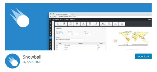
Snowball isn’t just a data visualization plugin. It’s a block post/page creation plugin that’s designed for journalists to create immersive articles.
One key feature of Snowball is the ability to make charts and graphs. You can use it to create bar charts and scatterplots as well as tables of data and maps.
You can use the graphical interface to make some changes to how your blocks of content look. If you want, you can go further and edit the CSS and HTML code.
Snowball is completely free and it’s maintained by the openHTML research team at Drexel University.
It should work with your existing theme. However, Snowball’s creators recommend enabling its built-in single column theme for your Snowball articles.
Best for: Including data visualization in long-form content, particularly if you want to also include maps or videos.
6. Easy Charts
Easy Charts is a free plugin that you can use to create a whole range of different charts. These include several types of bar chart and area chart, plus line charts, pie charts, donut charts, polar area charts, and waterfall charts.
Once you’ve put in your data, you can use it to create any type of chart. It’s easy to switch between the different charts and to preview how they’re going to look on your site.
Because it’s a free plugin, it doesn’t offer some of the advanced functionality you get with other plugins. For instance, you can’t create responsive tables of data that users can edit.
Best for: Creating a range of straightforward, free charts or graphs to display data on your website.
7. Data Tables Generator
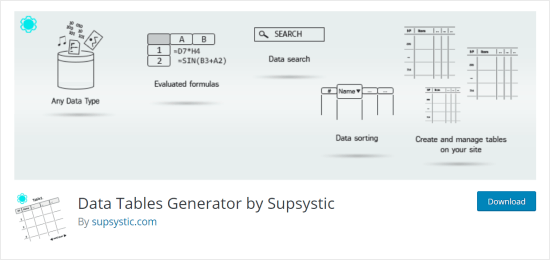
The Data Tables Generator plugin, from WordPress plugin creator Supsystic, lets you create responsive tables.
You’ll need the Pro version in order to create charts and graphs. These are provided through Google Chart’s technology. You can create all the standard types of chart that you’d expect, like bar charts, pie charts, donut charts, and more.
You can also use data that you’ve got in a spreadsheet elsewhere. The plugin supports importing from CSV, Excel, PDF, and Google Sheets.
One particularly handy feature is that Data Table Generator integrates with WooCommerce. You can use it to create product tables that users can easily search.
Best for: Creating tables of products in your WooCommerce store. These can be filtered and sorted by the user.
Bonus: Canva Infographics Maker Pro
Canva is a powerful design tool that lets you make beautiful infographics, blog visuals, and other graphics with a completely drag & drop interface. Although it’s not a WordPress plugin, it’s a tool that many bloggers use to create compelling visual content.
They also have pre-made templates for social media graphics for all platforms, posters, banners, flyers, powerpoint presentations, and so much more.
It’s basically a top web design software for non-designers because how easy it is to create something beautiful.
We hope this article helped you learn more about the best data visualization WordPress plugins. You may also want to check out our list of the must have WordPress plugins for all websites, and our comparison of the best WordPress page builder plugins.
If you liked this article, then please subscribe to our YouTube Channel for WordPress video tutorials. You can also find us on Twitter and Facebook.
The post 7 Best Data Visualization WordPress Plugins (Charts & Infographics) appeared first on WPBeginner.
from WPBeginner https://ift.tt/2Ra5o53
More links is https://mwktutor.com





No comments:
Post a Comment