Note: This is a guest post by Thomas Griffin, the co-founder of OptinMonster, the #1 conversion rate optimization tool. We’ll publish a guest post on WPBeginner every 2nd and 4th Thursday. This is an invite-only column, meaning we don’t accept unsolicited guest post offers.
Your pricing page is the single most important page that can make or break your business.
If you’re not focused on improving conversions on your pricing page, then you’re leaving a lot of money on the table.
With OptinMonster, I’ve had the privilege to help improve conversions on hundreds of websites and stores to help grow their sales and revenue.
Based on that experience, here’s my no-nonsense list of the best tips for how to grow your pricing page conversions by at least 30% today.
I will cover quite a few topics in this post. Here’s a handy list so you can jump to the section you are most interested in:
- Incentivize New Users to Try Your Product
- Create a Sense of Urgency to Persuade Action
- Convert Abandoning Visitors Into Customers
- Display Social Proof
- Prevent Choice Paralysis
- Briefly Explain Each Feature With a Tooltip
- Organize Features Into Different Categories
- Boost the Trust Factor
- Perform A/B Tests to Boost Conversions
1. Incentivize New Users to Try Your Product
Customer acquisition is the biggest challenge every eCommerce business faces, especially when starting out. People are often reluctant to buy a product from an online store they’ve never purchased from. And that’s why I always recommend incentivizing new users.
An incentive can be as simple as offering a discount to new users. eCommerce giants like Amazon offer huge discounts for first-time customers.
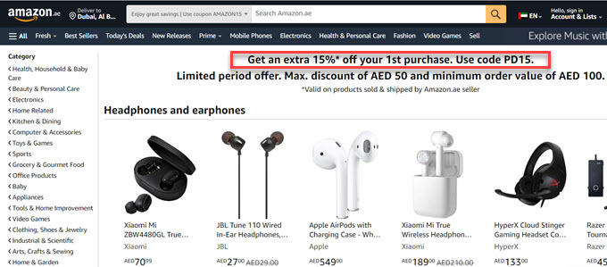
If you truly want to improve conversions on the pricing page, consider incentivizing new users.
For instance, take a peek at Bluehost’s pricing layout. They highlight discounted prices for new users alongside regular rates, emphasizing the savings.
This can be an effective incentive for customers to take action and sign up.
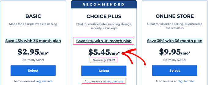
Besides that, they also link to the 36-month plan, where users can grab an even bigger discount. And finally, they add a disclaimer that the discount is only for the first payment and that renewals will be at the normal rate.
How to implement it in WordPress: The easiest way to offer discounts to new users is to use a plugin like Advanced Coupons. It integrates seamlessly with popular eCommerce plugins such as WooCommerce.
All you need to do is to set up a first-time coupon condition. This lets you offer the discount only to users who have made 0 previous orders.
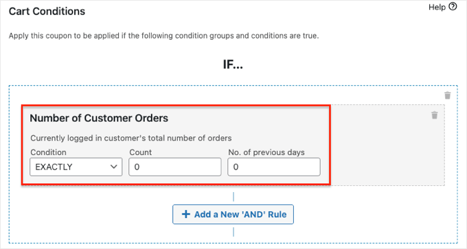
Advanced Coupons can also help you set up various coupon discounts, buy-one-get-one offers (BOGO), and loyalty programs on your website or online store.
For more details, you can see WPBeginner’s Advanced Coupons review.
2. Create a Sense of Urgency to Persuade Action
Creating a sense of urgency is another common strategy among eCommerce juggernauts. Yet, many small eCommerce stores aren’t taking advantage of this strategy.
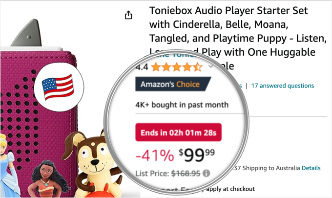
One of the easiest ways to create a sense of urgency is with a countdown timer.
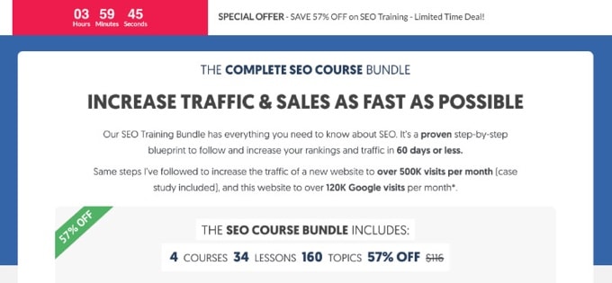
Countdown timers work.
In fact, Reliablesoft.net, one of our customers, increased their sales instantly by 20% only by placing a countdown timer.
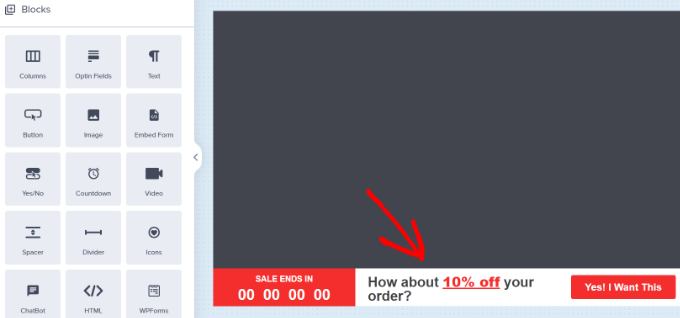
How to implement it in WordPress: You can easily add a floating bar countdown timer on your website using OptinMonster.
It’s as simple as dragging a block onto the screen as you design your new campaign and then setting up the timer.
3. Convert Abandoning Visitors Into Customers
Did you know that 70% of the visitors who leave your pricing page will never return?
That means most of your marketing efforts are going to waste unless you have a strategy to engage with people who abandon your pricing pages.
There are several ways to convert your abandoning users into customers. Here are 2 methods I use on all my websites to reduce pricing page abandonment:
Method #1. Create an Automated Email Abandonment Campaign
This tactic works when a customer abandons their cart after entering their email address during checkout.
You can collect this email address and reach out to them to complete the order with an automated email campaign.
In WordPress, the easiest way to set up a cart abandonment email campaign is with FunnelKit.
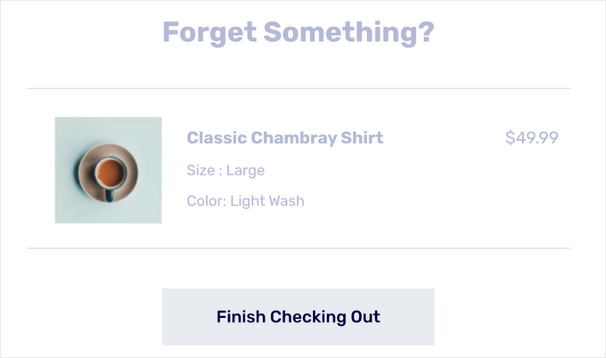
FunnelKit comes with a full library of email automation workflows, including abandoned cart workflows. These workflows include pre-written copy, delay intervals, goals, and more.
If you need more control over your email abandonment campaigns and also want to grow your email list, then you can use a standalone email marketing service like Constant Contact.
Alternatively, if you’d rather connect with your visitors after they leave your site via push notifications instead of emails, then you can use a tool like PushEngage.
Here’s an example push notification that encourages users to complete their purchases.

It will only work if customers agree to accept push notifications on your site before abandoning your cart.
For more details, check out a few ways to recover abandoned cart sales in WooCommerce.
Method #2. Show an Exit Intent Offer
Another proven strategy to reduce pricing page abandonment is to show an exit intent offer.
Exit Intent is an OptinMonster technology that triggers a popup exactly at the moment when customers leave your site.
One of our customers offers an additional 10% OFF to return to the shopping cart with an exit intent popup.
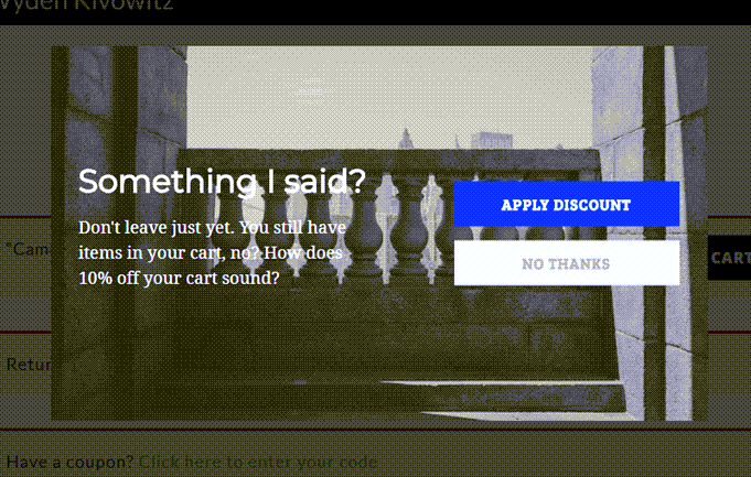
When a user accepts the offer by clicking on ‘Apply Discount’, they’ll be redirected to the WooCommerce coupon URL created earlier, which auto applies the additional discount.
Alternatively, if you don’t want to offer an additional discount, then you can just ask why they’re leaving and reach out to support via a contact form.
4. Display Social Proof
Fact check: 98% of visitors leave without buying, and 70% never return. While there are several reasons, one of them is trust issues.
That’s why social proof is so powerful. In fact, 92% of people trust a peer recommendation.
This explains why showing customer testimonials on your pricing page is so effective. They demonstrate that there are people who trust and use the product, as you can see on this website.
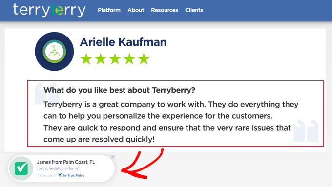
You can also display live, verified customer activity at the bottom of the screen.
This uses the psychology of the ‘fear of missing out’ or FOMO, which can boost conversions by as much as 15%.
How to implement: You can add FOMO to your own site in just a few minutes using TrustPulse. It’s the best social proof plugin for WordPress, and the setup is a breeze.
5. Prevent Choice Paralysis
Choice paralysis is a big reason why most pricing pages don’t convert well. Some pricing pages are too complicated. Customers don’t want to make the wrong choice, but the right choice is unclear.
That’s why you should keep your pricing page clean, clear, and simple. Highlight the most popular plan or the hottest deal, and explain the plan features in an infographic or table.
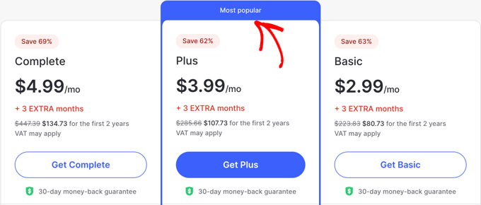
Once users know what’s popular, they can start to consider which plan is best for them.
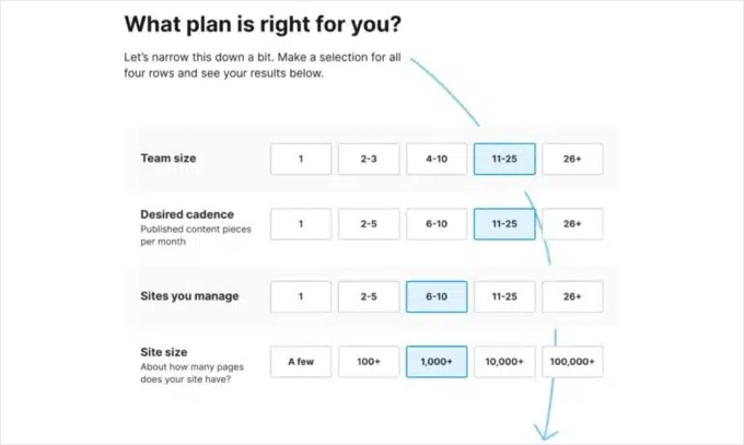
Some websites offer a quiz or questionnaire to clarify customer needs to identify which plan is better.
How to implement it in WordPress: You can create beautiful pricing tables by using a plugin like Easy Pricing Tables.
Start by choosing a template with the right look and feel, then customize it with your plan details. Don’t forget to mark one plan as featured or most popular.
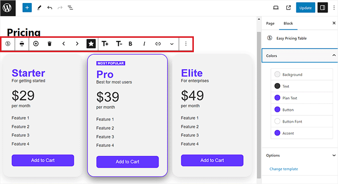
Or you can use a page builder like SeedProd. It offers attractive pricing table blocks that you simply drag onto your pricing page.
Make sure you use the plugin’s Advanced settings tab to customize the pricing block’s font, button color and size, and hover effects so the recommended plan is easy to spot.
6. Briefly Explain Each Feature With a Tooltip
While you can avoid information overload by keeping your pricing page simple, there are always going to be users who want to learn more about a certain feature or product. How can you do that without getting complicated?
This is where a tooltip comes in. A tooltip provides more information to customers who want it.
These hover-triggered information snippets offer additional details without overwhelming the user experience. Beaver Builder‘s pricing table does this incredibly well.
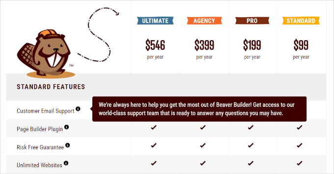
A tooltip can offer a brief text explanation or even include images and other rich content.
How to implement: You can easily add tooltips to your WordPress site using a free plugin like WordPress Tooltips. Setup is easy, but remember that too many tooltips can become distracting.
Take some time to take your tooltips to the next level. Choose fonts and colors that match your website’s branding, and tailor the content of the tooltip to match the specific feature.
Lastly, don’t put important information in tooltips. That should be in plain sight on the main page, and tooltips should add extra information for those who want to look for it.
7. Organize Features Into Different Categories
Some products and services have a lot of features. For customers to make an informed decision, these features will need to be listed on your pricing page, even if they add some complexity.
But just adding a long list of features isn’t going to help. The best feature lists can be carefully grouped into just a few categories that can make the information easier to digest.
Zendesk’s example illustrates this beautifully, enabling users to effortlessly compare and evaluate plans based on what is important to them and their business.
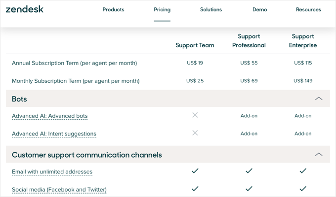
Notice that each feature is a link. These work a little differently from tooltips, but the idea is the same. When you click a link, you will see a popup with more details about that feature.
However, like a tooltip, these links don’t take the user away from the pricing page, so they are still more likely to convert.
How to implement: When using this strategy, you should take some time to decide which categories will help your customers move forward and make a decision.
You should take a look at the categories your competitors use for inspiration.
Finally, make sure you arrange the plans progressively, from fewer features on the left to more comprehensive offerings on the right.
8. Boost the Trust Factor
Earning customer trust is essential for conversions. With online sales, shoppers are not only concerned about purchasing an unsatisfactory product but also about the security of their personal and financial information
In my experience, a money-back guarantee is a great start because it reduces risk for your customers and can increase conversions and sales by as much as 15-30%.
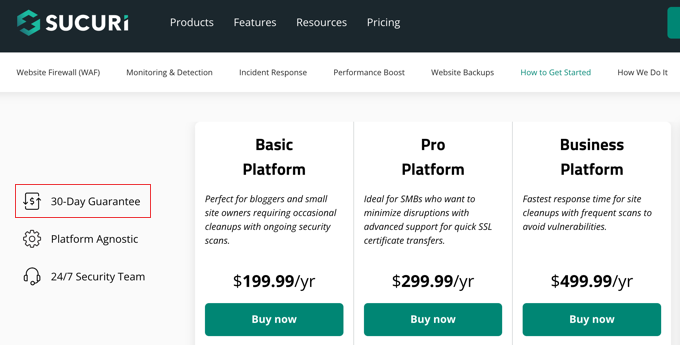
You’ll also need to tweak your pricing page to put customers at ease and help them feel safe. The best way to do that is to display privacy and security badges.
That’s because online payment fraud has tripled in the last decade, and 54% of online shoppers have experienced fraudulent or suspicious online activities. You can’t blame them for being cautious.
Platforms like WooCommerce offer trust badges, which can boost your website’s credibility and assure users of secure transactions.

How to implement: Depending on your needs, you can display trust badges by enabling WooCommerce settings, using a plugin or theme, or adding code to your online store.
You might be surprised by all of the different badges that are available. When done right, this can increase your overall sales by 15%.
9. Perform A/B Tests to Boost Conversions
Now, you might be wondering how to measure the impact of the changes you make to your pricing page. A/B testing is the answer.
My team and I routinely use A/B split testing to find out which version of a pricing page or landing page gets the most conversions. This way, we can be sure to choose the one with the best results.
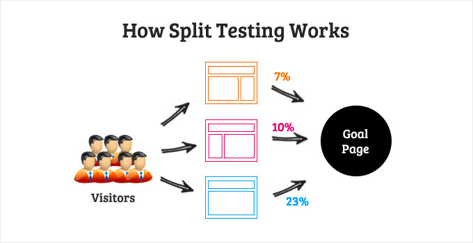
How to implement: There is a helpful guide on WPBeginner that has step-by-step instructions on how to do A/B split testing in WordPress.
Make sure you start with small changes, or it can be difficult to know why one version of your pricing page produces more conversions than another. For example, start by testing changes to your headline or call to action before making bigger changes.
Also, make sure you run the test long enough to gather the data you need to draw accurate conclusions and spot fluctuations in traffic.
Then, you can use what you have learned to make further changes and continually optimize your pricing page for more conversions.
I hope my insights helped you learn how to grow pricing page conversions. You may also want to see these WPBeginner guides for WooCommerce made simple or the best WooCommerce plugins for your store.
If you liked this article, then please subscribe to our YouTube Channel for WordPress video tutorials. You can also find us on Twitter and Facebook.
The post [Guest Post] How to Grow Pricing Page Conversions by 30% Today (9 Ways) first appeared on WPBeginner.
from WPBeginner https://ift.tt/LjdBsDS
More links is https://mwktutor.com
No comments:
Post a Comment